The Gallery One block presents a collection of gallery items in an interactive carousel layout. On desktop, it displays a two-column view with a featured image alongside text content, call-to-action links, and a thumbnail carousel for navigation. On mobile, the text stacks above a single-image swipeable carousel.
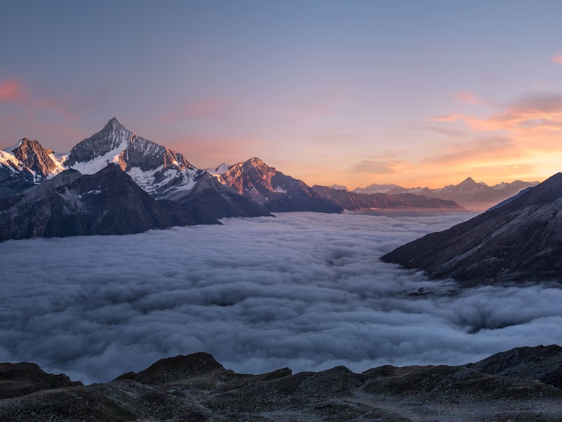
Mountains Alpine Peaks Towering peaks pierce the morning sky as dawn spills across alpine meadows, offering some of the most breathtaking vistas on Earth.
import mockedGalleryBlock from " @/data/mock/optimizely/gallery/gallery-block.json " ;
import { galleryCmsMappers } from " @/registry/rokkit200-ui/blocks/gallery/internals/lib/gallery-utils " ;
import { GalleryOne } from " @/registry/rokkit200-ui/blocks/gallery/variants/gallery-one/gallery-one " ;
import { mapCmsType } from " @/registry/rokkit200-ui/lib/content-mapper/content-mapper-util " ;
import { galleryBlockCodeModel, galleryBlockFragment } from " ../constants " ;
export default function GalleryOneDefaultDemo () {
const properties = mapCmsType (
mockedGalleryBlock . data . GalleryBlock . item
return < GalleryOne { ... properties ! } /> ;
query GalleryBlockQuery {
fragment GalleryBlockFragment on GalleryBlock {
GalleryOne is assembled from the following components:
Component Role CarouselProvides thumbnail navigation on desktop and swipeable image carousel on mobile RichTextRenders each gallery item’s body as structured rich text LinkGroupRenders the call-to-action links with primary/secondary variant slots ContentImageRenders gallery images with responsive <picture> support
Shared internals (gallery-internals) provide the GalleryProperties type, image profiles, and CMS mapper utilities used by all gallery variants.
Below is an example of how to use GalleryOne in your site.
import { GalleryOne } from " @/rokkit200-ui/blocks/gallery/variants/gallery-one/gallery-one " ;
import { mapCmsType } from " @/rokkit200-ui/lib/content-mapper/content-mapper-util " ;
import { galleryCmsMappers } from " @/rokkit200-ui/blocks/gallery/internals/lib/gallery-utils " ;
const properties = mapCmsType (galleryCmsMappers , galleryResponse);
return < GalleryOne { ... properties ! } /> ;
All visual customisation is done via className props. No additional CSS or theme tokens are required — pass Tailwind classes to adjust layout, spacing, typography, and media styling.
Flip the layout so the featured image appears on the trailing side.
Mountains Alpine Peaks Towering peaks pierce the morning sky as dawn spills across alpine meadows, offering some of the most breathtaking vistas on Earth.
import mockedGalleryBlock from " @/data/mock/optimizely/gallery/gallery-block.json " ;
import { galleryCmsMappers } from " @/registry/rokkit200-ui/blocks/gallery/internals/lib/gallery-utils " ;
import { GalleryOne } from " @/registry/rokkit200-ui/blocks/gallery/variants/gallery-one/gallery-one " ;
import { mapCmsType } from " @/registry/rokkit200-ui/lib/content-mapper/content-mapper-util " ;
export default function GalleryOneReversedDemo () {
const properties = mapCmsType (
mockedGalleryBlock . data . GalleryBlock . item
className = " [&>div:first-child]:md:flex-row-reverse "
Extends GalleryProperties (from gallery-internals).
Prop Type Default Description itemsGalleryItemProperties[]— Array of gallery items to display. Required. classNamestring— Classes applied to the root <article> element. textContainerClassNamestring— Classes applied to the text content wrapper. preHeadingClassNamestring— Classes applied to the <span> pre-heading element. headingClassNamestring— Classes applied to the <h2> heading element. bodyClassNamestring— Classes applied to the RichText component wrapper. linksClassNamestring— Classes applied to the LinkGroup wrapper. featuredImageContainerClassNamestring— Classes applied to the featured image container <div>. featuredImageClassNamestring— Classes applied to the featured ContentImage element. thumbnailCarouselClassNamestring— Classes applied to the thumbnail Carousel wrapper. thumbnailClassNamestring— Classes applied to individual thumbnail buttons.
Each item in the items array has the following shape:
Prop Type Description preHeadingstringPre-heading text displayed above the heading. headingstringThe item heading text. mainBodyRichTextNode[]Structured rich text nodes for the body content. linksLinkItem[]Array of link items rendered via LinkGroup. media{ imageSource, profile }Image source and responsive picture profile.
The root element is an <article> with aria-labelledby pointing to the heading, providing a labelled landmark for assistive technology.
The heading renders as an <h2>. Ensure it fits the document outline where the block is placed.
Thumbnail buttons include aria-label attributes describing the target gallery item.
The Carousel component provides built-in keyboard navigation, arrow buttons, and dot indicators with appropriate ARIA roles.
The featured image receives loading="eager" and fetchPriority="high" to prioritise above-the-fold rendering.